Fountain pen inks for calligraphy: Ferris Wheel Press
Do fountain pen inks have a place in a calligrapher's toolkit?
Calligraphers have an arsenal available to them when it comes to inks. This includes calligraphy inks such as Sumi ink, liquid, tube and pan watercolours, tube and pan gouache and more traditional inks such as walnut, bister and iron gall to name but a few.
Of these inks, some are limited in colours and others, such as watercolours and gouache, need an element of preparation to use with a nib. The benefit with watercolours and gouache is the freedom to mix a desired colour to match your project but sometimes you might have to use additives to get the right consistency and performance e.g. by adding gum arabic to act as a binder and thickener.
But sometimes, you're looking to reach for a gorgeous ink which you can use out of the box and, for me, the colour options and versatility afforded to calligraphers by fountain pen inks are unrivalled.
I've recently become familiar with the inks from Ferris Wheel Press to use with my calligraphy and art pieces. On both counts, I've been impressed with the sophisticated colours on offer and how through the magic of sheen and shimmer these inks become highly versatile and difficult to DIY.
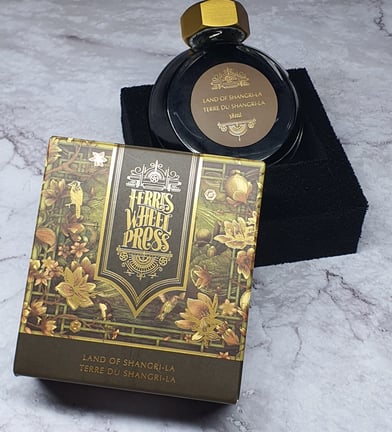
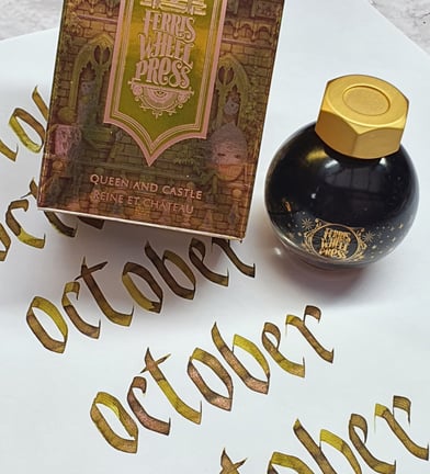
The first impression you have of FWP inks is the attention to detail of the packaging and bottle designs, whether its the round disk shape or completely spherical version you'll not be able to help being utterly charmed by the design, story and ink.
Each design is incredibly distinctive with a touch of fantasy and buckets of fun. The themes are illustrated with a charming play on the name of the ink and faithfully presented in the tones of the ink. Be it clocks, florals, stamps or animals it is clear that design has not taken a back seat in production and is unashamedly part of the experience of the FWP brand.
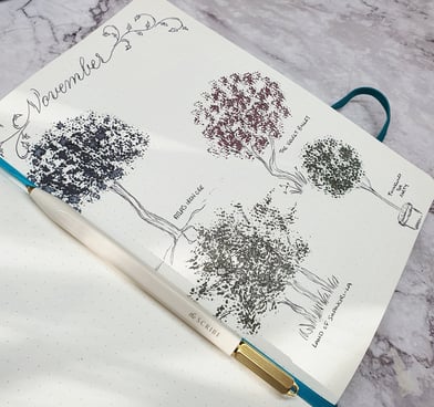
I'm principally a pointed pen calligrapher with limited experience of broad nibs. I can happily report that all the inks I've tried so far (circa 12) have all worked beautifully with all type of scripts and nibs, producing pleasing calligraphy pieces. I also weave in illustrations and backgrounds with my work, and in this too FWP inks excel. The inks introduced over a water wash produces the most wonderful effect due to chromatography (the separation of components in a mixture), revealing the component parts of the ink in wild and unexpected ways.
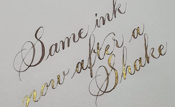
The bottle opening work well with most sizes of pen holders and nibs and the heavy duty hex nut for a lid makes a solid seal against a silicone liner. This is important for if you invest in one of FWP many inks with a shimmer or sheen, you will want to make the most of these effects by either shaking or stirring the ink. Personally, I enjoy maximum shimmer so I employ the use of my magnetic ink stirrer when I use shimmer inks. This is not essential but if like me you like calligraphy gadgets the stirrer affords me uninterrupted writing with consistent shimmer distribution.
Quite often, I use the inks 'shimmer free' so that I just get the base ink - yes, ladies and gents - two in one ink!
If these ramblings have you wanting to try Ferris Wheel Press inks for yourself, I've included a link below for some pennies off your order.
Ferris Wheel Press - 10% off using code S&F
And if you've been lucky enough to have experienced products from this wonderful stationery company I'd love to hear about this in the comments. What other tips and tricks have you tried with fountain pen inks in general?
©2021 Strokes and Flourishes